PROJECT OVERVIEW
As the name states, FinGuru helps users with finance management through gamification.
In this case study we delve into designing the goal setting feature and budget tracking with focus on user engagement.


Contex
FinGuru is an AI powered finance management app. By connecting to user's bank accounts and tracking spending habits and income, helps users in:
Managing all their finances in one place
Effortlessly setting personalized budget and goals to save more and invest
Helping them stick to their plans and improve their spending habits
Target Audience
People who:
Struggle with budgeting, saving and investing in general
Are used to budgeting manually but haven't had a good experience with finance management apps
Want to know where their money goes and stay on top of their finances
Challanges
With a retention rate of approximately 5% in finance management apps (by the 30th day of installing), we needed to figure out the reasons for drop offs in these apps.
Given the complexity and often overwhelming nature of finance, and the fact that fintech is associated with lots of numbers and boring charts, we needed to come up with strategies to maintain user motivation and also make it enjoyable and engaging.
THE PROCESS


DISCOVER
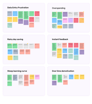
User Interview & Affinity Diagram
We asked mostly open-ended questions for a more engaging and conversational interview style, rather than sticking to a strict Q&A format.
Our questionnaire focused on:
1- What needs and expectations users have if they use budget apps
2- How to encourage them to stick to their plan
3-Why they stopped using previous finance management apps
Top Takeaways:
Automation, estimations and predictions to lower the manual entry and calculations
Strategies to manage overspending
Preparation of users for unexpected costs
Instant notifications to give users more control and room for growth
Clear and straightforward design with minimal learning curve

Competitive Analysis
In order to make more informed decisions, we evaluated some well-known apps from various perspectives which helped us with:

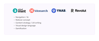
Strengths :
No jargon, only the necessary information
Intuitive data visualization tools to enhance user comprehension
Weaknesses :
Difficulty in reducing the learning curve specially for users who are new to budgeting apps
Inefficiency in automation of goal setting process
Inability to enhance user engagement and motivation to stick to their plans
Secondary Research: Gamification
For more inspiration for gamification elements we analyzed Duolingo, which makes a perfect case study considering user engagement.

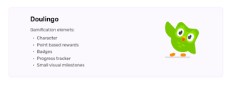
Pros:
A character makes the experience more friendly, fun and personalized
Point-based rewards are extrinsic motivators to give reason to users to come back
Badges fulfil the basic need for self-worth, an important intrinsic motivator. Plus, users can look at their earned badges and review their progress
Small visual milestones are manageable steps to motivate users to engage consistently
Cons:
Leaderboards, being compared to others and constantly competing can cause frustrations and anxiety in some users, also mentioned by some interviewees
DEFINE
Persona
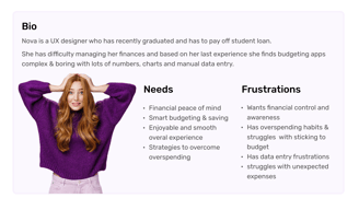
In order to establish tasks for our design, and to communicate information about the users that we collected during research, we developed a persona.

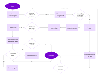
User Flow

DEVELOP
Ideation Session
Now it was time to have a meeting with the UX manager, stakeholders and engineers to present our identified challenges and developed solutions based on our research.
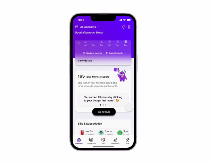
The official charecter of FinGuru: ‘Monstie’
A funny and friendly monster to soften the inherent complexity of fintech by serving as a:
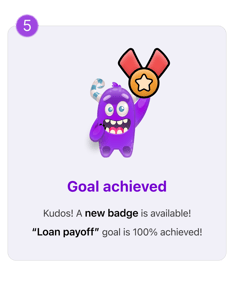
Motivational figure that celebrates achievements and milestones. This can keep user engagement high through a memorable and enjoyable experience
Guide to offer tips and personalized feedback to finish tasks and challenges
A sense of personality and consistency that ties different parts of the app together
Taming the finance management monster


The Initial Challenges & Our Solutions
Mid-Fi wireframes will be shown later.
Here, the Hi-Fi version is presented solely to clarify the solution. Full Hi-Fi version of the app will be shown in Deliver phase.
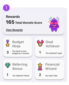
A lack of motivation over time can be addressed by incorporating badges and points, transforming non-game contexts into engaging challenges where users earn achievements and rewards through increased activities.

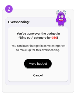
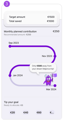
One of the most common challenges interviewees faced was overspending and not sticking to their budget, so our strategy to help users stay on track and motivated was to implement a modified version of the "Rollover" concept.

Stakeholders specifically requested an improvement in users' saving habits. As designers, we decided that roadmaps, progress trackers, and other strategies would encourage users to achieve their goals and set new ones.
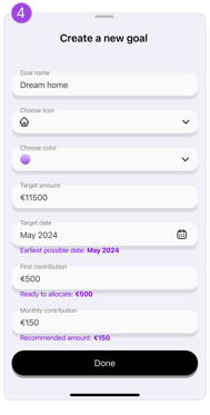
Automating objectives based on savings and spending habits can eliminate the frustration of manual calculations, making goal setting effortless and efficient through automation.


To address the challenge of users' lack of awareness, control, and motivation, we designed a strategy that compares their spending with the previous month, offers instant feedback, and provides tips to encourage growth and control.
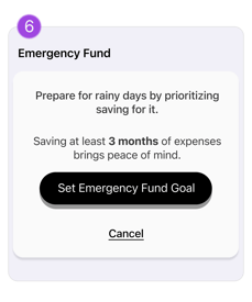
The challenge of losing peace of mind when facing unexpected expenses is addressed by prioritizing financial stability and security, with the suggestion to set an "Emergency Fund" as the first goal.


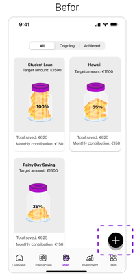
Mid-fidelity Wireframes


Profile
Goals
Add new goals
Goal details
Budget
Edit budget
Category detail
Iterations Phase 1
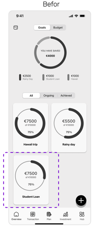
1.Goal Page
2.Set Goal Page
3.Budget Page
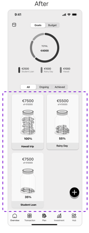
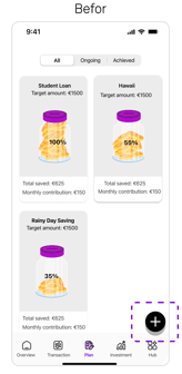
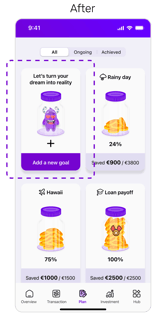
Small cards reduce scrolling and make it easy to check goals at a glance, while the jar of coins creates a stronger connection to real-world saving, making it more engaging and motivating—a great example of system and real-world alignment!
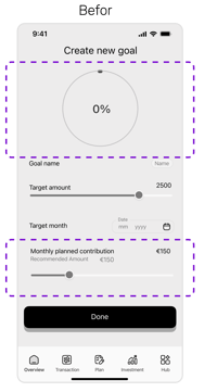
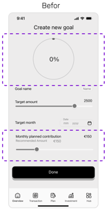
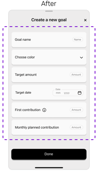
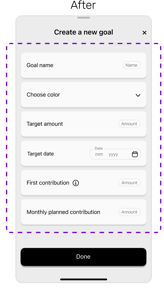
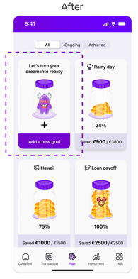
Showing 0% was removed to avoid demotivation.
Instead of having only one estimation with the rest set manually, we added more estimations.
We improved overall app consistency by designing this overlay in the same style as the others.
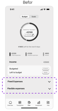
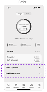
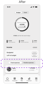
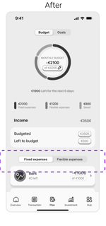
Accordions require more clicks and extra scrolling for the bottom option, while pivots reduce clicks by keeping one option always open and minimizing scrolling.
DELIVER
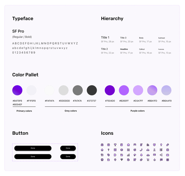
UI Kit
Iterations Phase 2
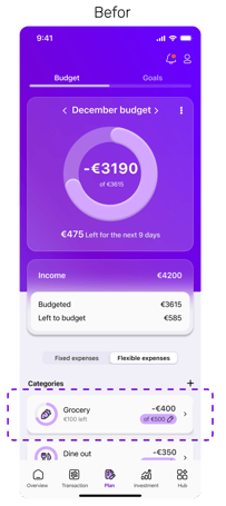
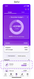
1.Budget Page
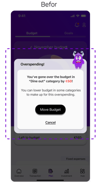
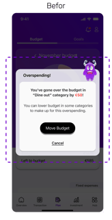
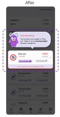
2.Overspending Alert
3.Goal Page
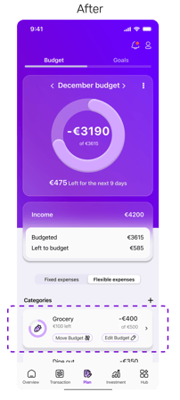

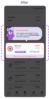
Instead of using the same button for editing and moving budgets between categories, we designed them separately to enhance intuition, clarity, and reflect their distinct purposes and flows.
The initial notification lacked clarity as it didn’t show the referenced card with details, making it hard to identify in later steps. Displaying the exact card and button in place improves context and usability.
The floating button lacked clarity without text, making it less inviting. The "Genie in the Bottle" concept for the "Add a New Goal" card made it clearer and more engaging, while its consistency with other cards improved flow.
4.Add a New Goal
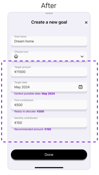
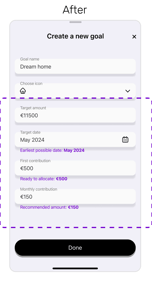
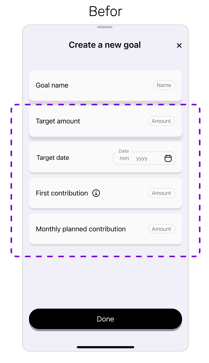
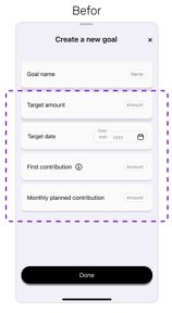
Users had to calculate timing and monthly amounts manually. Now, the app estimates based on spending habits and income, auto-filling details for convenience.
Clickable Prototype
Are you ready to see one of the coolest prototypes? ;)))))))))