JamFizz


Design of a website for musicians

PROJECT OVERVIEW

Business Needs
A website that has these characteristics: helps musicians easily connect, includes a safety message system, and offers a variety of job listings and rental studios.
Design Approach
In this case study we focused on the task of connecting musicians, to improve the user experience we used these following strategies.
Designing a search engine based on location to help users find their Musician
Organizing musician categories, filters and profile members information
A Platform designed to facilitate communication and collaboration among musicians.
THE PROCESS


User Interview
Affinity Diagram
Competitive Analysis
Persona
User Flow
Site Map
Mid-fi Wireframe
Usability & Iteration
Final Wireframe
Clickable Prototype
DISCOVER
User Interview & Affinity Diagram
We interviewed with 14 potential users to get insight through the following main questions:
1- What challenges musicians face when using an online platform to make connections.
2- What information or specific details are important on musicians’ profile.
Top Takeaways:
An efficient search method that allows them to find specific musicians in specific locations is crucial because they often use online platforms when they are away from their hometown or country.
Instant visibility: Ensure that key details such as genre, instrument, work samples and experience level are displayed on the profile Page.


Competitive Analysis
Through a detailed Analysis of these websites, we have designed a more effective information architecture and improved our website features.


DEFINE
Persona
Based on the information and researches we have done, we created one of our personas.


User Flow
We designed and developed a User Flow Considering potential users' needs and the project goals that describes the pathways user might take.


Site Map
Based on the results of competitive analysis and stakeholder needs, we designed our Sitemap. We've finalized an updated version according to usability tests that aligns with feedback.


DEVELOP
Wire Framing
Our research derived us into designing the first version of wireframes and we provided solutions for user's challenges and stakeholder's needs:
1- We designed a search box in homepage so that users can search musicians based on categories and location.
2- Filtering options include important features like Skill level, music Genre and language.
it is also possible to search profiles by their name or ID.
3- We've designed profiles to include a profile photo.
4- Users can put their sample work including music audios or videos in their profile page to show their style and profession.


DELIVER
Mood Board
We collected some photos of musicians and concerts that were full of energy and lights. These photos inspired us to choose a color palette for our website. The main idea was to bring the atmosphere of a concert stage or a recording studio, which are typically dark environments, and then add a touch of light color as our accent color.


UI Kit


Usability & Iterations
Phase 1
After designing the initial version and creating our UI kit, we developed a revised version for usability testing, which revealed two problems:
Problem 1
Having "Members" in the navigation bar was causing confusion during searches.
Solution 1
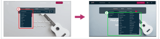
We designed a search engine in the hero area that includes, Musicians, Bands and search ID based on location and radius.


Solution 2
To improve, we moved these options to the search box, making them easier to find. Since they were no longer in the local filters, users found it hard to adjust their searches. So, we added a search box to the result pages for easy modifications.
Problem 2
During searches, users frequently sought options for ''ID searches'' or searching by ''area'', which were not readily available in the search engine. Placing these options in the local filters proved challenging for users.


Phase 2
After applying changes based on usability tests and iterations in phase 1, we faced three problems during phase 2 of usability testing and iterations:
Problem 1
Users faced challenges finding potential collaborators as they had to search through all profiles without knowing who was open to working together.
Solution 1
We added a "Seeking for" section to the local filter and clickable tags on profile cards to allow users to find members who are seeking specific types of musicians.

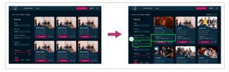
Problem 2
Users looking for musicians had to navigate a lengthy dropdown list to find the specific category.
Solution 2
To address this issue, we categorized musicians into three main groups: Instruments, Vocalists, and DJs, simplifying the selection process for users.

Solution 3
Through design adjustments, we strategically positioned essential details in highly visible areas.
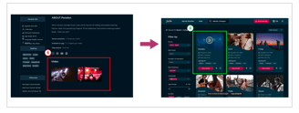
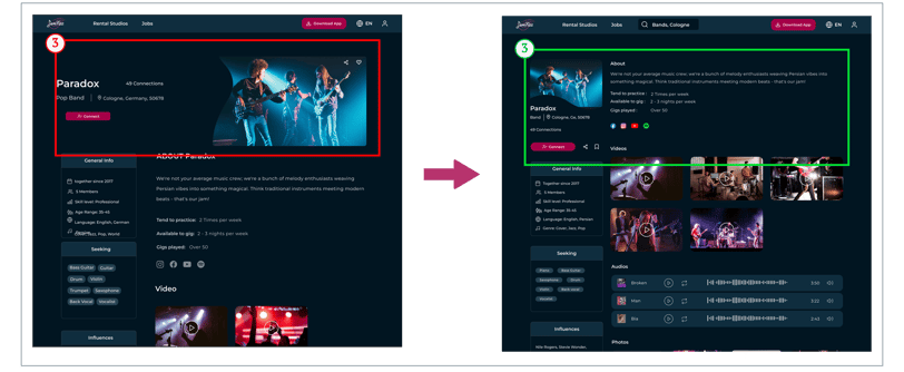
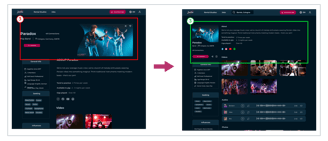
Problem 3
The initial layout prioritised the profile picture and general information, making it necessary to scroll to access key details like videos, Audios,...
Problem 4
The video of musician performances was included on the profile page, but during our usability tests, we discovered that it is crucial to see such content sooner.
Solution 4
Eventually, we designed a demo video that appears as a hover version on cards directly in the search section.

REFLECTION
What did I learn?
Effective communication and collaboration within the team.
Task prioritization for efficient project progression.
Integrating feedback from Users to evolve our project from concept to final design.
The Impact of Storytelling to convey the value and intent of our design choices.
What can we do next?
Designing jobs and rental studio page.
Working on the Jamfizz app, where users also can share Duets.